Research Overview

Some important conventions of the science fiction genre is the narrative element of good versus evil, a futuristic setting or an alternate timeline and the use of technology. I'm hoping to mirror these elements of the genre in my film, Blackout. However it will be the lack of technology that causes conflict rather than new technologies.
 The location for my film will be near an open field where I can capture the beauty of the sunset. I want to limit the amount of background scenery to give the illusion of being transported to another time where the world is not like our own. The locations will contrast each other. While shooting the scenes of the male lead the frame will be open, alluding to his supposed freedom to see the world. The scenes of the female lead will be all closed framing and shot inside, representing her trapped feelings. I have not picked out each individual location yet, but I know what kind of environment I’m looking for.
The font for my title sequence is meant to represent the neon lights that are used for storefronts. I want to use editing techniques to make them appear as if they are flickering on and off. The text font Ultra is my set font style as of right now. But it is subject to change if it is not suitable for the theme of my film.
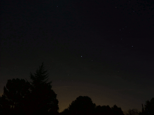


Kailin your blog is really good! The aesthetic of it all definitely goes along with your title "Blackout". In this post you mentioned how you wanted to emphasize the contrast in colors, shadows and lighting, which is something you've spoken to me about in class, so this post really helped me get more of a picture of what tone you are going for.
ReplyDelete